

Presidential Election Posters
Election posters have evolved into slick marketing tools. But if you look at the evolution of campaign posters you’ll see early efforts were far more clunky than clever.
Simplicity rules today’s presidential election posters. Political marketers long ago voted to engage focus groups to test taglines to death and, in a daring attempt to reach a younger audience, add a dash of trendy design.
This is a fairly new and radical development.
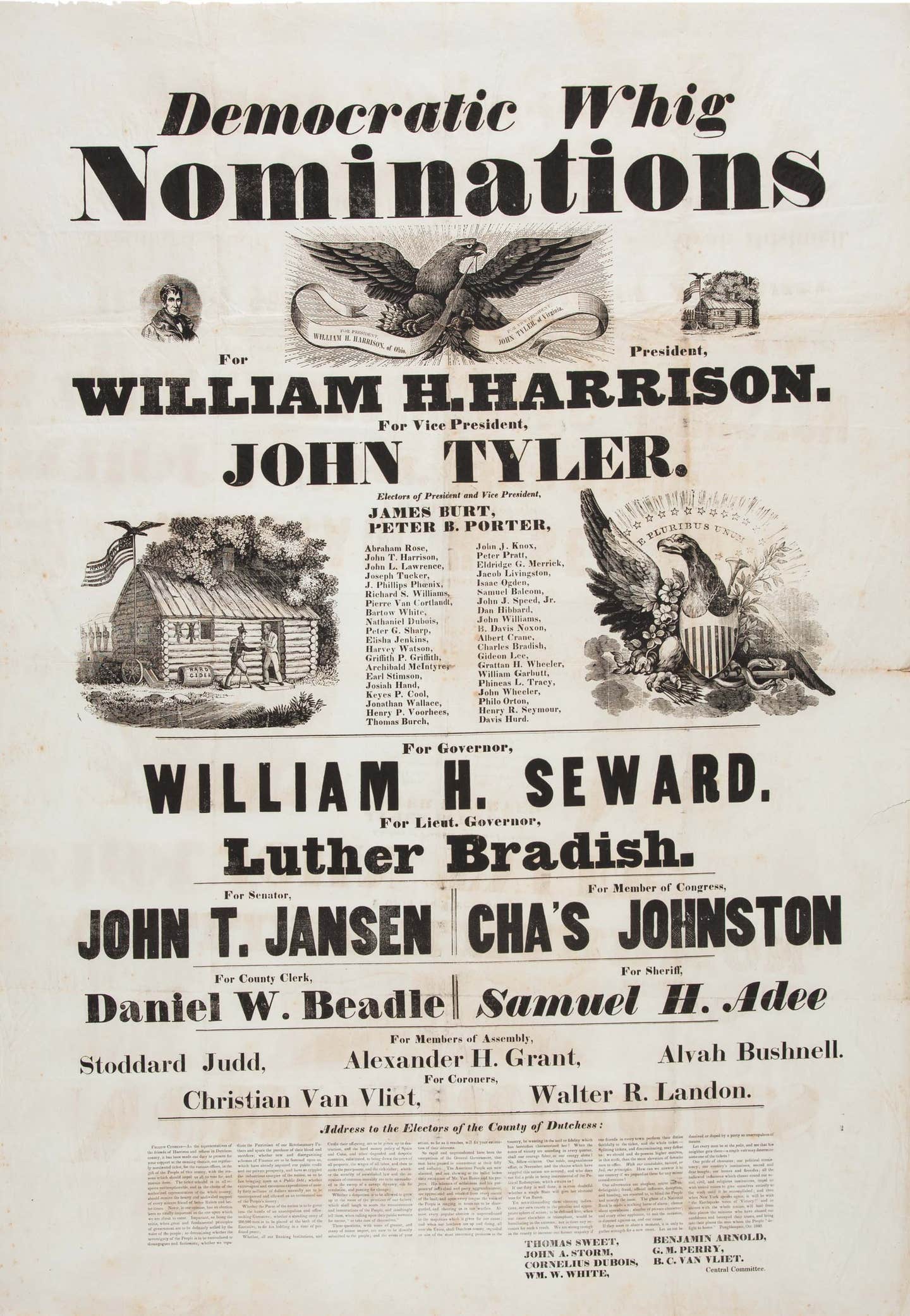
Although John Quincy Adams was the first presidential candidate to use posters in 1824, the oldest campaign poster in the digital files of the Library of Congress belongs to William Henry Harrison from 1840. The poster is, in a word, clunky.
There’s a reason for that.
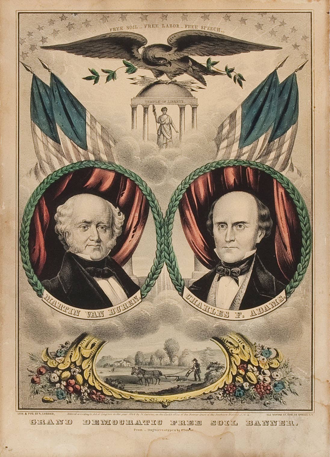
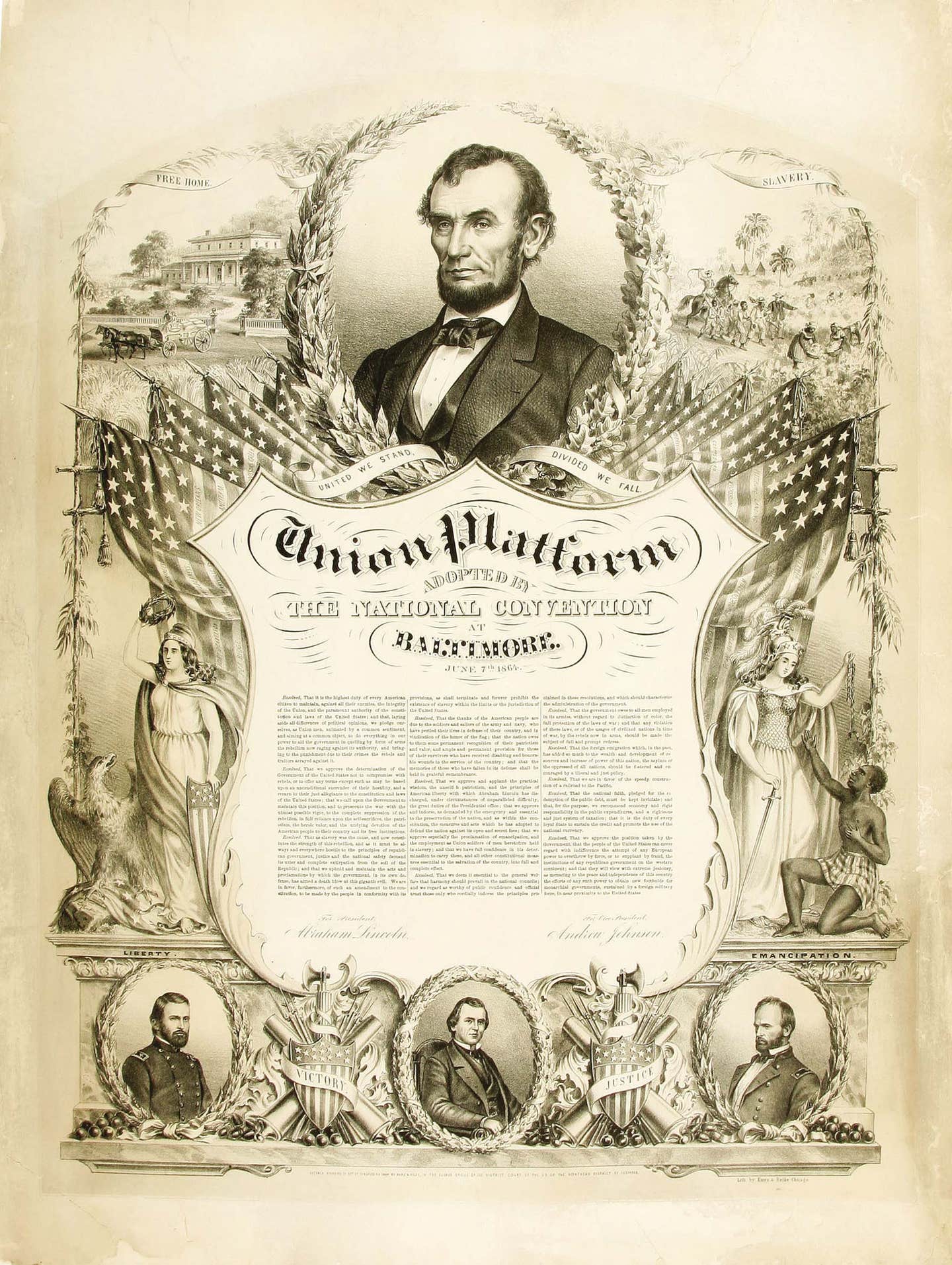
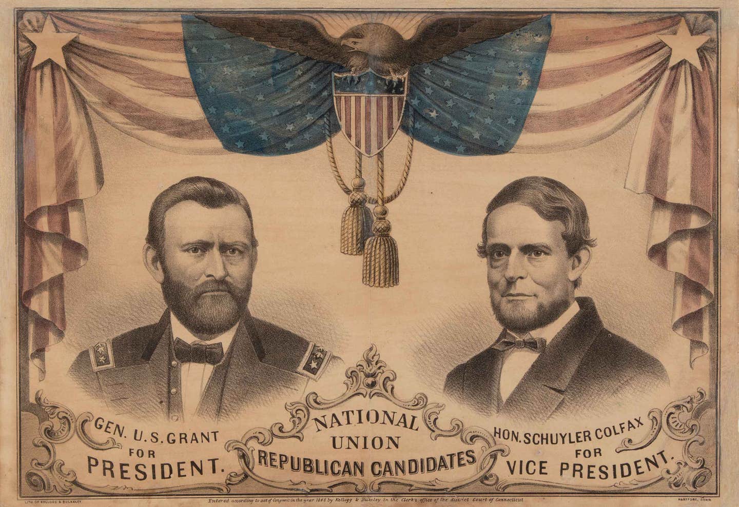
In the 1800s, posters were far more detailed and featured etched portraits of candidates looking stately and stuffy. Printers used wood or metal plates, making the early efforts look even more stiff. Blocks of text were often the main feature of the poster because it was far easier to reproduce words than images.
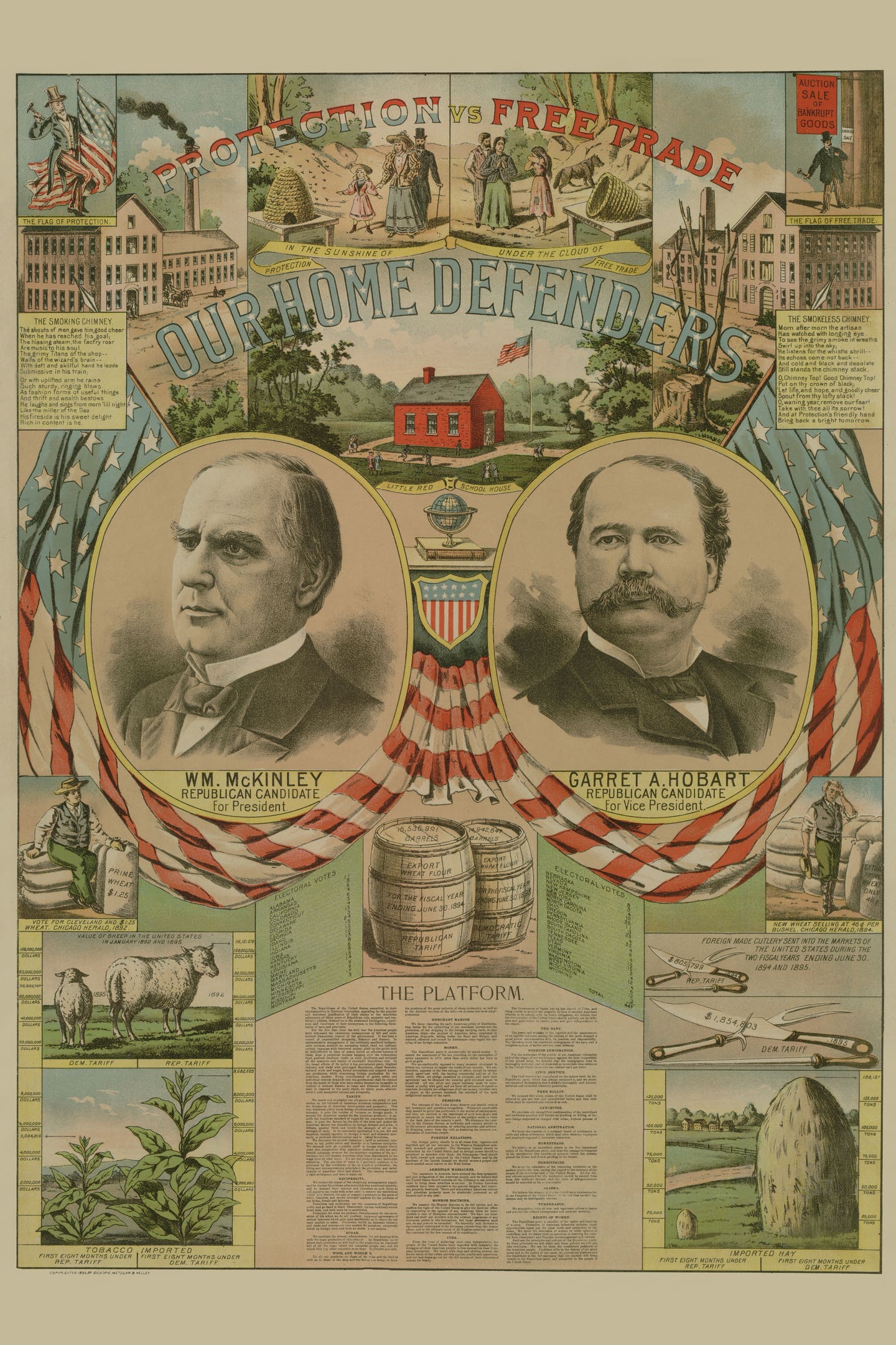
By the end of the 19th century, with the advent of the camera, posters took on a more life-like look. Images of candidates began to dominate posters. Not only did advancements in photography and design propel poster change but so did emerging media.
For instance, Franklin Delano Roosevelt used radio to speak directly to citizens, giving thirty “fireside chat” radio addresses during his presidency. He also became the first American president to be televised.
The advent of radio and television meant election posters didn’t have to carry the load of a candidate’s message.
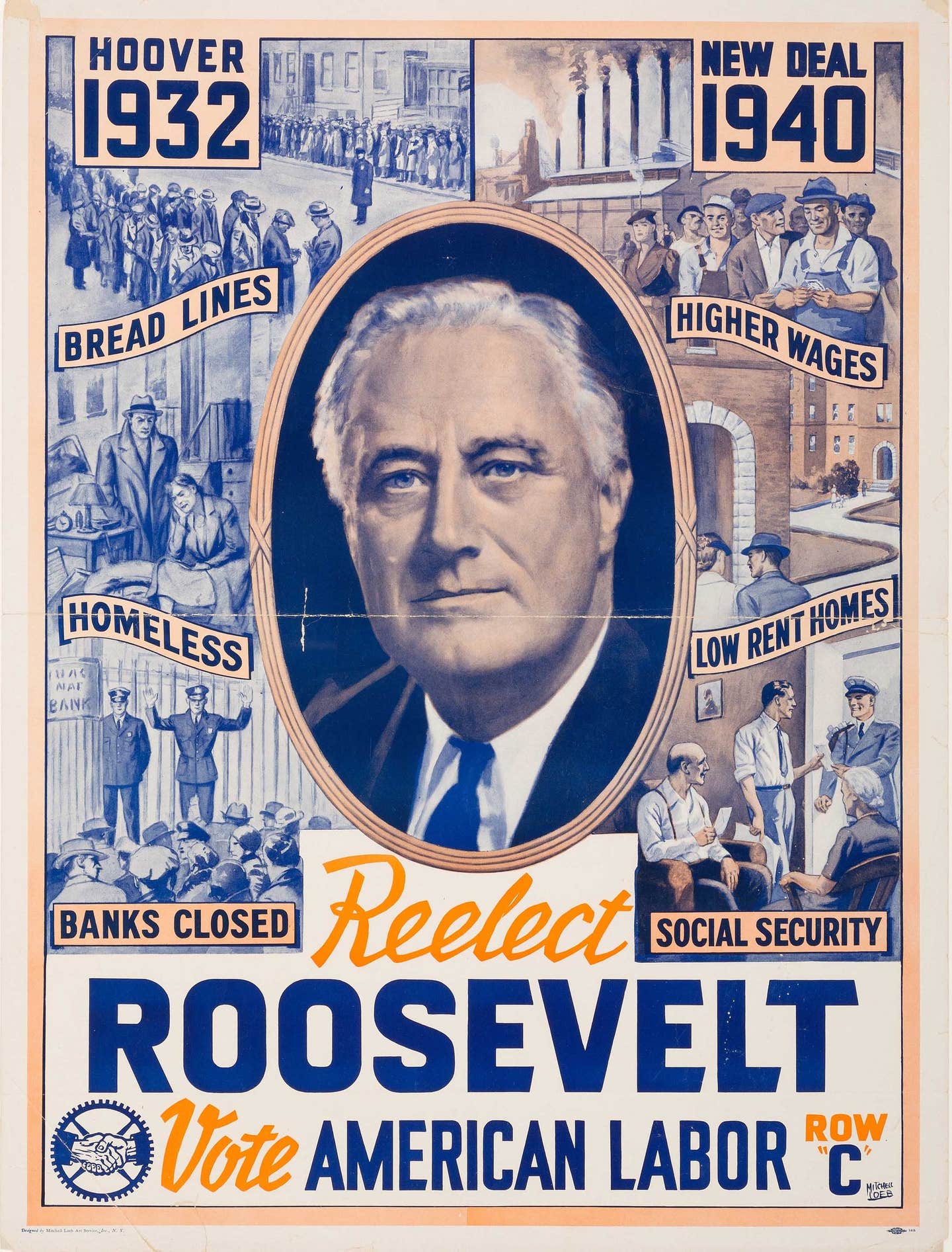
By the middle of the 20th century, posters utilized big, block-letter slogans and the candidate’s photograph, replacing lengthy political ramblings etched in prints of the 1800s.
Offset printing became the dominant commercial-printing technology in the 1950s. By the time Richard Nixon ran for office in 1972, color photographs and full-color design had replaced black-and-white posters.
Printing advancements, however, have less to do with modern posters than the sophisticated advancements in marketing. A candidate’s name, face and market-researched slogan are the norm.
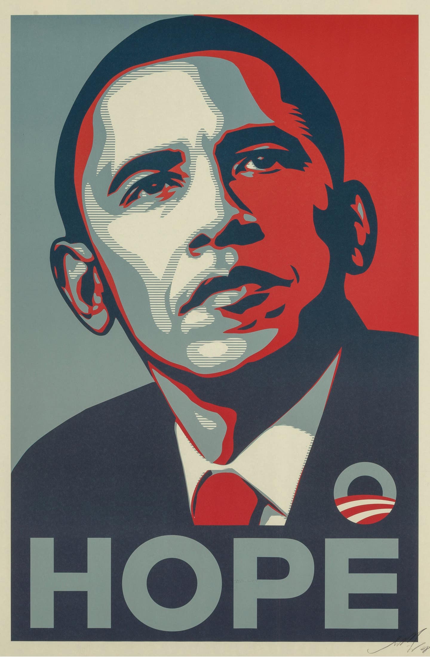
But even the norm was challenged with Barack Obama’s iconic “Hope” poster designed by artist Shepard Fairey. The poster, consisting of a stylized stencil portrait of Obama in solid red, beige and blue, with the word “progress,” “hope” or “change” below, came to represent Obama’s 2008 presidential campaign. Many consider the piece groundbreaking.
Paul Kennedy is Editorial Director of the Collectibles Group at AIM Media. He enjoys Mid-century design, photography, vintage movie posters and people with a good story to share. Kennedy has more than twenty-five years of experience in the antiques and collectibles field, including book publishing. Reach him at PKennedy@aimmedia.com.